Group exhibition
'Fields for Propositions'
29 januari t/m 12 maart 2005
DUSTIN LARSON, DUSTIN LARSON, GERHARD RICHTER,
JOËLLE TUERLINCKX, KLAAS KLOOSTERBOER,
MARIJKE VAN WARMERDAM, OLIVIER MOSSET, STEEL STILLMAN

left side: Dustin Larson, middle: Steel Stillman, right side: Olivier Mosset
In de beeldende kunst bestaat Fundamentele kunst naast Conceptuele kunst, documentaire fotografie naast realisme.
Maatschappelijk kritische kunst naast analytische kunst. Participatiekunst naast Confessiekunst.
Conceptkunst naast Narratieve kunst. Servicekunst naast Atelierkunst. Kortom het kunstbos is erg groot.
De tentoonstelling 'Fields for Propositions' wil inzicht geven in wat een kunstwerk zelf aanreikt en wat er in een kunstwerk gezien kan worden als je de context van de makerswereld kent. Het gaat over het bekijken van kunstwerken van twee kanten, namelijk enerzijds die van het theoretische vlak, van hoe het werk binnen het oeuvre van de kunstenaar gezien kan worden en anderzijds gaat het over hoe het werk sec overkomt, het picturale veld; 'je ziet wat je ziet'. Kortom we zien wat een kunstwerk presenteert of wat het representeert. Of zien we in het tweede geval spoken en willen we dat alleen maar graag zien? Of maakt het helemaal niet uit hoe we het zien, zolang we maar wat interessants zien, zoals het toevallige detail dat het oog vasthoudt en betovert, zoals Roland Barthes dat het "punctum" noemde?
Alle werken in de tentoonstelling 'Fields for Propositions' bestaan uit duidelijk van elkaar gescheiden ideeënwerelden. Er is gekozen voor werk met een monochroom of zelfs monotoon karakter. In eerste instantie is dat een formele kwestie. Er is sprake van dimensies, waarbij de opbouw en de beslissingen in het werkproces eenvoudig terug te vinden zijn. Het gaat dan om een kleine optelsom van twee of drie duidelijk te onderscheiden vlakken of momenten. Daarnaast kan er iets verteld worden over de context waarin de werken zijn gemaakt. Zo'n kennisverschuiving positioneert het werk anders dan wanneer alleen naar de uiterlijke verschijning wordt gekeken, zoals het zich direct aan ons voordoet.
Gerhard Richter toont een klein werk 'Acht Grau'. Het is een reproductie van een van de acht glazen tableaus die hij in 2002 voor de Deutsche Guggenheim in Berlijn heeft gemaakt. Er zitten twee opvallende kanten aan. Het gereproduceerde werk zoals het zich voordoet; een monochroom blauwgrijs vlak in de vorm van een prentbriefkaart. De kaart is pontificaal voorzien van een fikse handtekening van de kunstenaar midden op het monochrome beeld. Dit is de concrete kant er van. De andere kant is het werkveld van waaruit de kunstenaar werkt. Hij plaatst vooral bij werk in oplage zijn handtekening op het beeld in plaats van er onder. In dit geval is er sprake van een reproductie van een kunstwerk 'Acht Grau', waarop de handtekening zo groot op de afbeelding is gezet, dat die handtekening zelf een beeld is geworden. Deze fungeert nu als een eerste dimensie, die natuurlijk als laatste is aangebracht. De aanvankelijke status van een gewone reproductie op een ansichtkaart is veranderd in een nieuw beeld. Dit werk is voor de uitnodigingskaart van de tentoonstelling 'Fields for Propositions' nogmaals - maar nu als een nieuw grafisch kunstwerk - gereproduceerd. Het is een meer dan redelijke conclusie die je eigenlijk alleen kan trekken als je het oeuvre van Richter kent.
Dustin Larson is net afgestudeerd aan de Rijksakademie in Amsterdam. Hij laat een aantal doeken en een serie digitale prenten zien met onmiskenbaar een dualistische blik op de wereld. Ook zijn andere werken met beeld en taalbeeld komen uit een denkwereld van categorische voorstellingen, die hij meer dan een tweeledig beeld wil laten zijn, lijkt het.
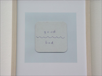
Dustin Larson
zonder titel, [detail] 2005
60 x 60 cm
oilstick op doek
blok van 6 of 9 doeken
Olivier Mosset laat onder andere een monotoon raster en vier werken van puur katoen zien. Het eerst genoemde werk betreft een zeefdruk en toont een constructivistisch raster van 100 x 100 cm. Op het gebied van de kijken roept het werk een verrassende zachte schoonheid op. Het laatst genoemde werk is concreet en bestaat uit niet meer dan vier doeken van katoen. Het is de eerste dimensie van wat er te zien valt. Een tweede dimensie is, dat een goed ingevoerde kijker weet, dat Olivier Mosset steeds in zijn werk streeft naar een niet-persoonlijke en niet-emotionele uitgangspositie, waarbij hij het liefst een werk maakt dat "door iedereen gemaakt had kunnen zijn". Hij zegt hierover: "The idea was that Clem Greenberg said that a stapled canvas was a painting, but not necessarily a good one. I just wanted to check that."
De werken van Klaas Kloosterboer tonen het concrete vlak van het doek met sculpturale eigenschappen, die zorgen voor een illusionistisch tweede vlak. Het werk is concreet en simpel, maar speelt ook met het idee van verschijnen en verdwijnen. Kloosterboer staat vooral bekend om zijn omtrekkende bewegingen rondom schildersdoek en sculptuur. Het eerste heeft bij hem altijd met het laatste te maken en andersom. Zijn werken zijn verrassend krachtig, hebben een extreem fysieke presentie, vooral omdat ze er snel gemaakt uitzien. Spel, souplesse en inventiviteit is het veld waarin hij werkt om zo te komen tot een verzoening van 'mooi' en 'waar'. Een ander werk van Kloosterboer laat een fotowerk uit 1989 zien dat zeer onscherp is en dat een kleurig object lijkt te zijn. Als dat als een picturale dimensie te beschouwen is, dan is de tweede dimensie er een van vrolijkheid en optimisme dat direct door het werk wordt aangereikt. Een derde maar andere dimensie is die van de fysieke aanwezigheid van het fotograferen veroorzaakt door de onscherpte van de foto. Dat is een typisch werkwijze van de kunstenaar, maar je leest dat alleen zo als je het oeuvre van de kunstenaar kent. Die specifieke kennis maakt het beeld extra overtuigend.
Steel Stillman toont voor het eerst fotowerken. In dit nieuwste werk uit 2005 is het monochrome vlak in de hoeken 'onwillig', zou je kunnen zeggen, omdat daar onverwachte versieringen of opgekruldehoeken te zien zijn. In dit fotowerk worden twee proposities gedaan: aan de ene kant willen deze werken met nadruk monochroom zijn, maar daarentegen lijken de krulversieringen daartoe niet bereid. Deze letterlijke beeldstrijd zorgt voor een verfrissende verwarring. Komt dat omdat ik zijn oeuvre goed ken en weet dat zijn andere werk feitelijke contouren zijn van delen uit architectuur en uit interieurs?
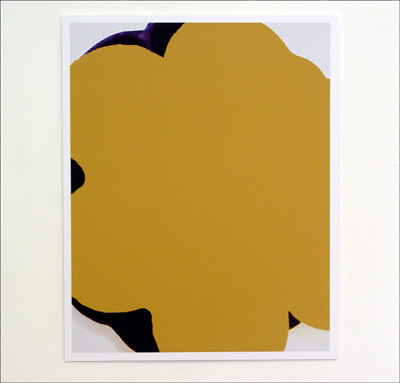
Steel Stillman
Untitled # 1 en Untitled # 2 (ochre shape), 2005
61,5 x 49 cm
digitale fotoprint, editie 3
Joëlle Tuerlinckx laat een werk 'Ça, lŕ' uit 1994 zien, dat op de tentoonstelling 'Tekeningen en tekeningen' in Galerie van Gelder in 1995 te zien was. Het toont een ca 20 cm dikke laag meel in doosvorm op een werktafel, gemaakt van een verrassende en fragiele materiaalsoort. Het tafelblad als vlak presenteert opnieuw een vlak. Als je het oeuvre van Joëlle Tuerlinkcx kent plaats je 'Ça, lŕ ' in haar wijze van werken met 'arme materialen', waarmee zij accuraat de wereld om haar heen definieert. De precisie waarmee zij dat doet is zo groot, dat zij in werkelijkheid het menselijk oog en brein en de werking daarvan beschrijft.
De tentoonstelling 'Fields for Propositions' wil inzicht geven in wat een kunstwerk zelf aanreikt en wat er in een kunstwerk gezien kan worden als je de context van de makerswereld kent. Het gaat over het bekijken van kunstwerken van twee kanten, namelijk enerzijds die van het theoretische vlak, van hoe het werk binnen het oeuvre van de kunstenaar gezien kan worden en anderzijds gaat het over hoe het werk sec overkomt, het picturale veld; 'je ziet wat je ziet'. Kortom we zien wat een kunstwerk presenteert of wat het representeert. Of zien we in het tweede geval spoken en willen we dat alleen maar graag zien? Of maakt het helemaal niet uit hoe we het zien, zolang we maar wat interessants zien, zoals het toevallige detail dat het oog vasthoudt en betovert, zoals Roland Barthes dat het "punctum" noemde?
Alle werken in de tentoonstelling 'Fields for Propositions' bestaan uit duidelijk van elkaar gescheiden ideeënwerelden. Er is gekozen voor werk met een monochroom of zelfs monotoon karakter. In eerste instantie is dat een formele kwestie. Er is sprake van dimensies, waarbij de opbouw en de beslissingen in het werkproces eenvoudig terug te vinden zijn. Het gaat dan om een kleine optelsom van twee of drie duidelijk te onderscheiden vlakken of momenten. Daarnaast kan er iets verteld worden over de context waarin de werken zijn gemaakt. Zo'n kennisverschuiving positioneert het werk anders dan wanneer alleen naar de uiterlijke verschijning wordt gekeken, zoals het zich direct aan ons voordoet.
Gerhard Richter toont een klein werk 'Acht Grau'. Het is een reproductie van een van de acht glazen tableaus die hij in 2002 voor de Deutsche Guggenheim in Berlijn heeft gemaakt. Er zitten twee opvallende kanten aan. Het gereproduceerde werk zoals het zich voordoet; een monochroom blauwgrijs vlak in de vorm van een prentbriefkaart. De kaart is pontificaal voorzien van een fikse handtekening van de kunstenaar midden op het monochrome beeld. Dit is de concrete kant er van. De andere kant is het werkveld van waaruit de kunstenaar werkt. Hij plaatst vooral bij werk in oplage zijn handtekening op het beeld in plaats van er onder. In dit geval is er sprake van een reproductie van een kunstwerk 'Acht Grau', waarop de handtekening zo groot op de afbeelding is gezet, dat die handtekening zelf een beeld is geworden. Deze fungeert nu als een eerste dimensie, die natuurlijk als laatste is aangebracht. De aanvankelijke status van een gewone reproductie op een ansichtkaart is veranderd in een nieuw beeld. Dit werk is voor de uitnodigingskaart van de tentoonstelling 'Fields for Propositions' nogmaals - maar nu als een nieuw grafisch kunstwerk - gereproduceerd. Het is een meer dan redelijke conclusie die je eigenlijk alleen kan trekken als je het oeuvre van Richter kent.
Dustin Larson is net afgestudeerd aan de Rijksakademie in Amsterdam. Hij laat een aantal doeken en een serie digitale prenten zien met onmiskenbaar een dualistische blik op de wereld. Ook zijn andere werken met beeld en taalbeeld komen uit een denkwereld van categorische voorstellingen, die hij meer dan een tweeledig beeld wil laten zijn, lijkt het.
Dustin Larson
zonder titel, [detail] 2005
60 x 60 cm
oilstick op doek
blok van 6 of 9 doeken
Olivier Mosset laat onder andere een monotoon raster en vier werken van puur katoen zien. Het eerst genoemde werk betreft een zeefdruk en toont een constructivistisch raster van 100 x 100 cm. Op het gebied van de kijken roept het werk een verrassende zachte schoonheid op. Het laatst genoemde werk is concreet en bestaat uit niet meer dan vier doeken van katoen. Het is de eerste dimensie van wat er te zien valt. Een tweede dimensie is, dat een goed ingevoerde kijker weet, dat Olivier Mosset steeds in zijn werk streeft naar een niet-persoonlijke en niet-emotionele uitgangspositie, waarbij hij het liefst een werk maakt dat "door iedereen gemaakt had kunnen zijn". Hij zegt hierover: "The idea was that Clem Greenberg said that a stapled canvas was a painting, but not necessarily a good one. I just wanted to check that."
De werken van Klaas Kloosterboer tonen het concrete vlak van het doek met sculpturale eigenschappen, die zorgen voor een illusionistisch tweede vlak. Het werk is concreet en simpel, maar speelt ook met het idee van verschijnen en verdwijnen. Kloosterboer staat vooral bekend om zijn omtrekkende bewegingen rondom schildersdoek en sculptuur. Het eerste heeft bij hem altijd met het laatste te maken en andersom. Zijn werken zijn verrassend krachtig, hebben een extreem fysieke presentie, vooral omdat ze er snel gemaakt uitzien. Spel, souplesse en inventiviteit is het veld waarin hij werkt om zo te komen tot een verzoening van 'mooi' en 'waar'. Een ander werk van Kloosterboer laat een fotowerk uit 1989 zien dat zeer onscherp is en dat een kleurig object lijkt te zijn. Als dat als een picturale dimensie te beschouwen is, dan is de tweede dimensie er een van vrolijkheid en optimisme dat direct door het werk wordt aangereikt. Een derde maar andere dimensie is die van de fysieke aanwezigheid van het fotograferen veroorzaakt door de onscherpte van de foto. Dat is een typisch werkwijze van de kunstenaar, maar je leest dat alleen zo als je het oeuvre van de kunstenaar kent. Die specifieke kennis maakt het beeld extra overtuigend.
Steel Stillman toont voor het eerst fotowerken. In dit nieuwste werk uit 2005 is het monochrome vlak in de hoeken 'onwillig', zou je kunnen zeggen, omdat daar onverwachte versieringen of opgekruldehoeken te zien zijn. In dit fotowerk worden twee proposities gedaan: aan de ene kant willen deze werken met nadruk monochroom zijn, maar daarentegen lijken de krulversieringen daartoe niet bereid. Deze letterlijke beeldstrijd zorgt voor een verfrissende verwarring. Komt dat omdat ik zijn oeuvre goed ken en weet dat zijn andere werk feitelijke contouren zijn van delen uit architectuur en uit interieurs?
Steel Stillman
Untitled # 1 en Untitled # 2 (ochre shape), 2005
61,5 x 49 cm
digitale fotoprint, editie 3
Joëlle Tuerlinckx laat een werk 'Ça, lŕ' uit 1994 zien, dat op de tentoonstelling 'Tekeningen en tekeningen' in Galerie van Gelder in 1995 te zien was. Het toont een ca 20 cm dikke laag meel in doosvorm op een werktafel, gemaakt van een verrassende en fragiele materiaalsoort. Het tafelblad als vlak presenteert opnieuw een vlak. Als je het oeuvre van Joëlle Tuerlinkcx kent plaats je 'Ça, lŕ ' in haar wijze van werken met 'arme materialen', waarmee zij accuraat de wereld om haar heen definieert. De precisie waarmee zij dat doet is zo groot, dat zij in werkelijkheid het menselijk oog en brein en de werking daarvan beschrijft.
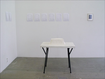
Joelle Tuerlinckx
'Ça, lá', 1994
variabele maten
meel op tafel, tekeningen
certificaat, gesigneerd
Marijke van Warmerdam laat het werk ''92-'96' zien. Een vlak met vijf achtereenvolgende jaartallen onder elkaar.
Het lijkt te gaan om de schoonheid van een concrete mededeling op een zwart vlak, maar de meer dan feitelijke
opsomming van de jaartallen doen ook vermoeden, dat het om belangrijke jaartallen gaat. Wat kan de kijker zich
nog herinneren van 1992, 1993, 1994, 1995 en 1996? Zijn die zo maar uit het gezichtsveld verdwenen, zoals de
onnoemlijke hoeveelheid afval dat we in die jaren de vuilnisbak ingooiden?
Het werk ''92-'96' krijgt een andere dimensie als de kijker weet dat dit werk door Marijke van Warmerdam is gemaakt,
die bekend staat om haar filmloops. De cijfers vormen een sequentie zoals een stukje film uit een loop ook een
sequentie van opeenvolgende beelden is.
English version
In art you have Fundamental art alongside Conceptual art, documentary photography alongside realism, art critical of society alongside analytical art, participatory art alongside confessional art, concept art alongside narrative art, service art alongside studio art. In short, the forest of art is awfully big.
The aim of 'Fields for Propositions' is to provide insight into what an artwork itself supplies and what there is to be seen in an artwork when you know the world of its creator. It's a question of looking at artworks from two sides, on the one hand that of the theoretical sphere, how the work can be viewed within the artist's oeuvre, and on the other hand it's about how the work comes across on its own merits, the pictorial field; 'what you see is what you get'. In short, we see what an artwork presents or what it represents. Or in the second case are we seeing phantoms, and is that all we want to see? Or does it make no difference at all how we perceive it, as long we just see something interesting, like the chance detail that grabs and captivates the eye, what Roland Barthes called the "punctum".
All the works in 'Fields for Propositions' comprise worlds of ideas that are clearly distinct from each other. There is work of a monochrome or even monotonous nature. In the first place that's a formal issue. It's a case of dimensions where the construction and the decisions in the working process are easy to recognise. It's a question then of a small sum of two or three clearly distinguishable areas or moments. In addition, something can be told about the context in which the works are made. Such a shift of knowledge positions the work differently than when we only look at its external appearance, the way it appears to us directly.
Gerhard Richter is showing a small piece, 'Acht Grau'. It is a reproduction of one of the eight glass tableaux which he made in 2002 for the Deutsche Guggenheim in Berlin. There are two notable sides to it: the reproduced work as it appears to us - a monochrome blue-grey area in the form of a postcard. The artist's signature is vigorously and pontifically applied in the middle of the card's monochrome image. This is the concrete side of it. The other side is the field of action that the artist is working from. With editioned works he places his signature onto the image instead of under it. In this case we are dealing with a reproduction of a work of art, 'Acht Grau', where the signature placed on the picture is so large that it becomes an image in itself. This now functions as a first dimension, which of course has been applied last. The initial status of an ordinary reproduction on a postcard is transformed into a new picture. The piece has been reproduced yet again, but now as a new piece of graphic art, for the invitation card of the exhibition 'Fields for Propositions'. This conclusion can only in fact be reasonably drawn if you're familiar with Richter's work.
Dustin Larson recently graduated from the Rijksakademie in Amsterdam. He is showing a number of canvasses and a series of digital prints that unmistakably reveal a dualistic view of the world. His other works with image and imaged text also originate from a way of thinking in terms of categorical representations, but it seems that they are intended to be more than dualistic images.
Among the works of Olivier Mosset are a monotonous grid and four pieces made of pure cotton. The first is a silkscreen print showing a graphic 100 x 100 cm grid. The way it looks evinces a surprising and soft beauty. The latter pieces are concrete and consist of nothing more than four separate cotton canvasses, this being the first dimension of what you see. A second dimension, as those familiar with Mosset's work will know, is that he is always striving in his work for a non- personal and non-emotional point of departure, preferring to make work that "everyone could have made". He comments on this work as follows: "The idea was that Clem Greenberg said that a stapled canvas was a painting, but not necessarily a good one. I just wanted to check that." And thus he checked this four times...
The works of Klaas Kloosterboer show the concrete surface of the canvas with sculptural qualities producing an illusory second surface. The work is concrete and simple, but also plays with the idea of appearing and disappearing. Kloosterboer is mainly known for the way he outflanks the painter's canvas and sculpture. The former always has to do with the latter, and vice versa. His works are surprisingly powerful and seem extremely physical, particularly as they look quickly made. Play, suppleness and inventiveness define the field in which he works, as a way of achieving a reconciliation of 'beauty' and 'truth'. Another of Kloosterboer's works is a photo piece from 1989. Extremely out of focus, it appears to be of some colourful object. If that is to be regarded as a pictorial dimension, then the second dimension is one of gaiety and optimism conveyed directly through the work. A third, but different dimension is that of the physical presence of the act of photographing caused by the photograph's blurredness. This is typical of Kloosterboer's way of working, but you only read it thus when you know his oeuvre. This specific knowledge makes the image extra convincing.
Steel Stillman is showing photo works for the first time. In this latest work from 2005 the monochrome area in the corners is 'reluctant', you could say, because unexpected embellishments or curled up corners are to be seen there. These photoworks are making two propositions: on the one hand they want to be emphatically monochrome, but on the other hand the scrolls seem disinclined. This literal visual struggle ensures a refreshing confusion. Is that because I know his oeuvre well and know that his other work actually consists of parts taken from architecture and interiors?
Joëlle Tuerlinckx is showing 'Ça, lŕ', a piece from 1994 which was previously shown in 1995 in the exhibition 'Drawings and drawings' in Galerie van Gelder. It shows a roughly 20 cm thick layer of flour in the form of a severely truncated pyramid on a worktable. Eight drawings have been recently added by the artist. The tabletop as surface presents yet another surface, but then of a surprising and fragile type of material. When you know Joëlle Tuerlinckx's work you can place 'Ça, lŕ' in her way of working with 'poor materials', which she uses to accurately define the world around her. The precision with which she does that is so great that in reality she is describing the workings of the human eye and brain.
Marijke van Warmerdam is showing a piece titled ''92-'96', consisting of a field with five successive dates underneath each other. It seems to be about the beauty of a concrete announcement on a black surface, but the more than factual listing of the dates makes one suspect that it's a question of important dates. What can the viewer still remember of 1992, 1993, 1994, 1995 and 1996? Have they simply disappeared from sight, like the immense amount of rubbish that we threw into the garbage bin in those years? ''92-'96' acquires another dimension when the viewer knows that the piece is made by Marijke van Warmerdam, who is known for her film loops. The numerals form a sequence just as a piece of film from a loop is also a sequence of successive images.